Dear reader,
A cover is more than a pretty picture on a book. It is the first small appointment with a stranger: this is what you may expect. And readers, as you know, have excellent memories for broken appointments.
The useful question about gothic romance covers starts with the image and goes further: what does the cover make the reader expect from the book?
This matters especially now. Gothic is visible again — in fashion, music, film, television, and across all those lovely online corners where an aesthetic is collected, polished, and passed around like a calling card. Dark houses, family secrets, forbidden attraction, inheritances, curses, locked rooms — readers know this vocabulary. A manor house and a decorative title can say Gothic while leaving the most useful question unanswered: which kind?
Literary? Romantic? Historical? Fantastical? Sensual? Horrifying?
And that is where the real work of the cover begins. I looked at five covers from the current shelf — four recent, one still very much in command of the conversation — as a reader rather than a designer. I asked the plain, severe question: What is this book promising me?
A small caveat before we begin (you knew there would be one): covers vary by territory, edition, and format. A foil-heavy collector’s hardback offers different evidence from an ebook thumbnail in a crowded shop. Compare like with like, or you will end up briefing one ball and arriving at another.
The heroine as the gothic signal
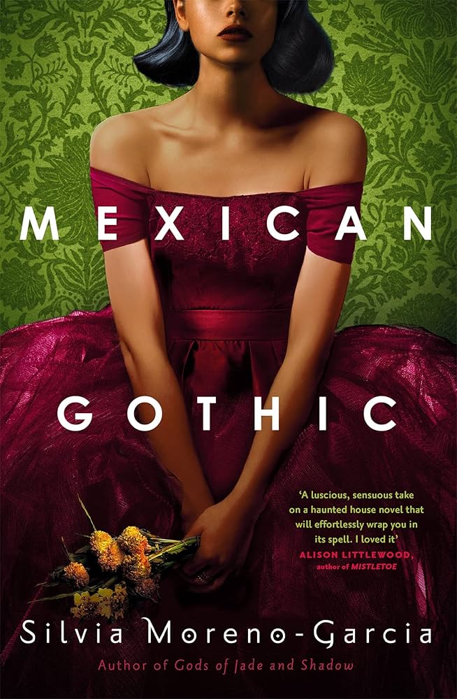
Mexican Gothic
Mexican Gothic by Silvia Moreno-Garcia is, by now, the elegant older relation on this list. It was published in 2020, but it is still one of the covers every gothic designer has to answer in some way.
The interesting decision is this: the house is absent.
Instead, we see a woman in a vivid magenta dress against dark green patterning. Her face is cropped, her identity partly withheld, and the wallpaper presses closer than any wall needs to. Domestic space becomes the threat. No tower, no gate, no storm — and still the message is immediate: something here is wrong.
The promise is precise: heroine-centred historical gothic, with menace before romance. The cover invites you to come for the woman at the centre of the trouble rather than announcing the love story first.
The lesson is beautifully simple. A gothic novel can carry its genre signal through a figure held inside a dangerous world, even when the mansion stays off the cover.
The risk sits on the other side. If romance drives the book, this kind of packaging may whisper it too softly. The romance reader may pass by, which would be a pity — readers only know what we show them.
The book as a precious object
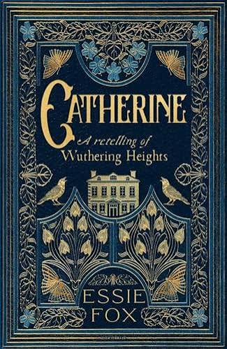
Catherine
Catherine by Essie Fox — a retelling of Wuthering Heights — takes almost the opposite route. The heroine stays out of the foreground. Structure, ornament, dark blue and gold take her place. The house sits inside a botanical frame, composed with the formality of a family crest or an altarpiece.
The cover does more than illustrate a scene. It says: this book has lineage. Treat it with ceremony. Open it, and enter.
The promise: historical gothic, literary prestige, feminist reinterpretation, atmosphere before visible heat. And yes, ornament can become too much very quickly. Here it works because the discipline is strict: controlled symmetry, limited colours, one central image, and the surrounding details kept firmly in service.
Ornament with discipline reads as craft. Ornament that lacks discipline reads like an overfilled drawing room (and we all know how quickly the wrong aunt can stay too long).
The possible misreading: this design may look like a classic reissue. If the book contains strong romantic tension, the cover keeps that tension very properly gloved.
The estate as warning sign
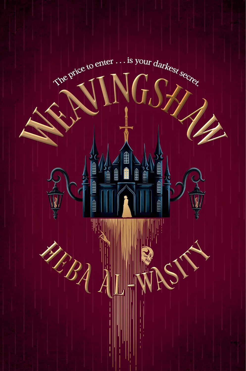
Weavingshaw
Weavingshaw by Heba Al-Wasity shows where the classic house-led cover is moving. The estate is no longer simply a place one might enter. It is a sign. Red and black, sharply reduced, with a vertical form through the composition that feels almost blade-like.
The house serves as a warning rather than decoration.
That joins two familiar cover languages: the old gothic house and the modern emblem. Readers who also read romantasy understand this kind of sign very quickly. A strong symbol survives at thumbnail size, and it can easily be carried across a series.
The promise: cursed estate, supernatural danger and romantic tension under pressure. This is consequence rather than cosy haunting.
The risk: a symbol this mythic promises a great deal. If the novel inside is quiet family psychology in period dress, the reader may have expected more curse, more threat, more world.
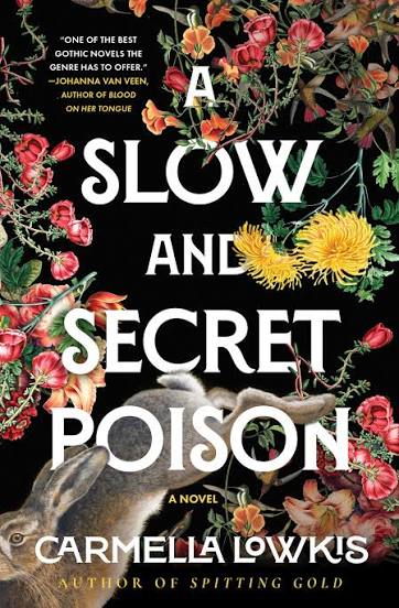
One book, two promises
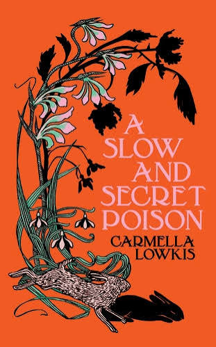
A Slow and Secret Poison
A Slow and Secret Poison by Carmella Lowkis may be the most useful example, because different editions of the same book create quite different expectations.
One edition uses a botanical image: orange ground, dark plant, hare, no house at all. It feels literary, controlled, poisonous in both the literal and the social sense.
Another leans on typography: dark field, large pale lettering, more immediate threat. The book moves closer to thriller packaging.
The text stays the same. The first signal changes.
So here is the small, important rule: a comp title is more than a book. It is a particular edition, in a particular market, making a particular promise. If you tell a designer, “Something like this,” show the exact edition. Otherwise everyone may discuss the same title while imagining different covers.
It also shows how much type can do. The symbols can stay the same while the expectation shifts. Larger lettering, darker pressure, harder contrast — and poison in the garden becomes danger at your shoulder.
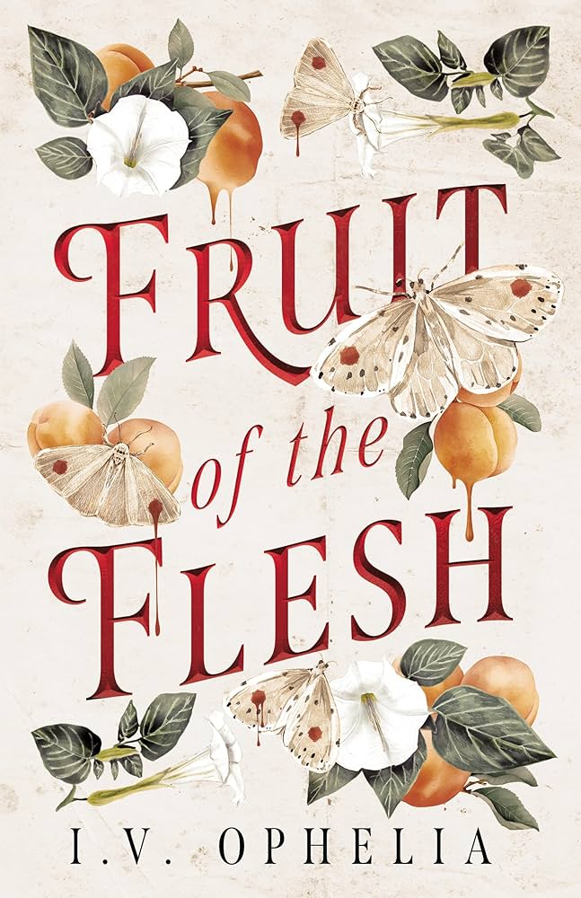
Sensuality without bodies
Fruit of the Flesh
Fruit of the Flesh by I. V. Ophelia shows how far indirection can go. Pale ground, fruit, botanicals, stains, moths, elegant red lettering. At first glance, almost a still life. Then the word flesh arrives — and suddenly everything is body, hunger, temptation, decay.
That is a very gothic trick: the image attracts and unsettles in the same breath.
The promise: historical, sensual and psychologically dark. The cover suggests heat sideways. It uses no bodies, obvious pose or open scene, yet the sensuality remains.
The cost of that elegance: some readers who shop by visible heat may read it as too discreet. Indirection is lovely. It also asks for a reader willing to read the hint.
What gothic romance covers have in common now
Gothic romance has no single look. It has habits.
Put these five covers side by side and no single fixed look appears. That may be the most useful observation.
Typography is no longer just labelling. It carries mood. It can confine, threaten, glitter, whisper, shout, or keep its manners in a way that is almost worse.
Colour has become freer. Gothic can use black, grey and burgundy, but it can also use magenta with green, orange with black, cream with blood-red, or blue with gold. A bright cover can still carry a dark book.
Botany, too, has lost its innocence. Plants stand for poison, inheritance, desire, decay, family secrets, and all the things that look charming in a garden and do quite different work in the body.
Most of all, a strong cover needs a clear main decision. One shape must survive at thumbnail size. The details may reward a closer look, but they cannot all demand equal attention.
This is where many cover drafts go wrong. The elements may all be attractive, yet too many of them want equal importance. House, woman, key, rose, blood, moon, dress, raven, letter, mirror — at some point gothic becomes inventory. A pretty inventory, perhaps, but still inventory.
Borrowed signals are obligations
Every borrowed signal makes a promise.
Gothic romance is borrowing generously from its neighbours. Literary gothic lends restraint and negative space. Romantasy lends emblems and series language. Historical romance lends fabric, proximity, and social pressure. Dark romance lends harder red-black contrast and aggressive type. Horror lends distortion and scale.
That is allowed. Covers have always borrowed from their neighbours.
But every borrowed signal is an obligation. If a cover looks like dark romance, the reader expects more danger, more heat, or more hardness. If it looks like romantasy, the reader expects world, myth, perhaps magic. If it looks like literary gothic, the reader expects language, atmosphere, and psychological depth.
A cover may flirt, certainly. It should arrive in the right gown for the book’s ball.
Borrow the principle, not the props
What should a stranger expect after one and a half seconds?
The lesson of these five covers is quite plain: the strongest gothic romance covers decide first what the book sells before anything else.
- The woman?
- The relationship?
- The house?
- The world?
- The concept?
- The appetite?
Everything else on the cover must deepen that answer. It has to support the main signal.
That is why a designer needs more than “I want a magenta dress too,” “Could we have a hare?” or “Can the title be large like that thriller?” Those are props. They may work, but only when they create the right expectation.
The more useful question is:
What should a stranger expect after one and a half seconds?
Ask what the reader believes they are allowed to buy. That question takes you further than a list of things the reader can see.
Then the book has to keep that promise.
The cover makes the first promise. The novel has to keep it. If you would like to go deeper into structure, atmosphere, and dark romantic tension, my Gothic Romance Masterclass walks you through the rooms of the genre, one by one.